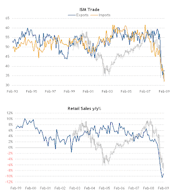
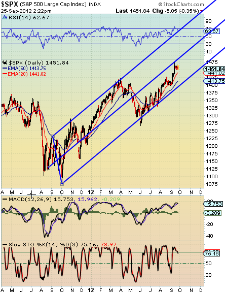
The light grey SPY/SPX charts I placed in the background end in MAR 2009, so there's often a single month bar hanging out on the right hand side - unless it's a chart that ends in MAR. Or if the chart ends in Q4 2008 there will be several bars hanging over the right margin.
Since the base source was not precise on begin dates I had to approximate & infer some, but it should be pretty close. If you see somethig that I can fix just let me know.
The up-down alignment is fairly subjective and often placed as vertically centered as possible, but sometimes adjusted up or down simply to reduce obfuscation of the index by the chart itself.
So... pay attention.
(You get what you pay for. HA!)


